Introduction:
You know that awkward moment when you’re at a party and someone just stands there, hoping you'll strike up a conversation? Well, that’s pretty much how most call-to-actions (CTAs) behave online—desperate, a little needy, and let’s be honest, not very compelling.
But if you’re in the digital marketing game, you don’t have time for wallflower CTAs. You need ones that walk into the room, grab your attention, and say, "Hey, click me, because your life will be better for it." So, let's dive into the magical world of crafting CTAs that actually drive conversions—without the virtual puppy eyes.
1. Ditch the “Submit” – You’re Not a Bank
If your CTA says “Submit,” congratulations, you’ve just transformed your website into a tax form. No one wants to submit unless it’s an expense report. Spice it up! Try something like “Let’s Do This” or “Get Your Freebie Now!” Your CTA should feel like it’s inviting them to a party, not requesting a wire transfer.
Humor works, too. “Click Here to Make Your Day 10x Better” sounds way more exciting than “Submit Your Info.” If your audience cracks a smile, they’re already in a good mood to hit that button.
2. Keep It Simple, Smarty (KISS); Be Clearer Than Your GPS
Your CTA should be easy to understand in a single glance. If you have to explain it, you've already lost the battle. No one’s going to click a button that says, “Proceed with the following online document registration in order to acquire further communication from our established newsletter department.” Ugh, just reading that made me age five years. Short, snappy CTAs like "Shop Now," "Get Started," or "Learn More" do wonders. It’s like offering someone a free sample versus forcing them into a 3-hour product demo.
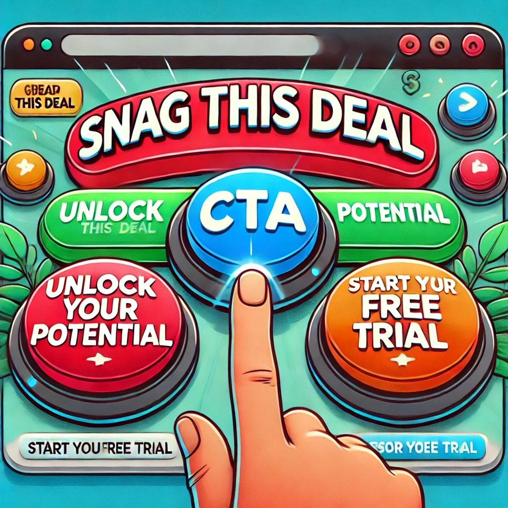
If your CTA is too mysterious, people will feel like they’re clicking into the abyss. “Click here to see what happens” feels like a bad prank. Tell them exactly what to expect: “Get Your Free E-Book,” “Book a Free Consultation,” or “Start Your Free Trial.” People want clarity, not surprises—unless you’re giving away surprise kittens. (Spoiler alert: You’re probably not.)
3. Urgency: Address the FOMO (Fear of Missing Out)
Humans have an unhealthy obsession with not missing out. It’s why we stay up way past bedtime doomscrolling, and why we rush to download apps we never actually use. Your CTA should trigger that instinct. Phrases like "Only 24 Hours Left!" or "Don’t Miss Out on Your Free Trial" create a sense of urgency.It’s like telling someone, "Hey, this cool thing is leaving soon, and if you don’t grab it now, you’ll be stuck with your sad, CTA-less existence forever." No one wants that.
But beware of the over-urgent CTA. If every button on your site screams “NOW OR NEVER,” your visitors might get the same anxiety as hearing “last call” in a bar. Use it wisely.
4. Make It About Them, Not You.
Let’s face it: People are self-centered. Your CTA shouldn’t say, “Check out our awesome features.” It should say, “Get your dream product now.” Make it personal. “Find Your Perfect Fit” sounds way more enticing than “See Our Products.” You want to create a mini fantasy for them.
Think of your CTA as a friendly nudge: “Unlock Your Potential” makes them feel like they’re about to win a life-changing game show, while “Learn More” sounds like something a dull professor would say right before assigning homework.
5. Color Me Converting
Ah, the art of CTA button color. Should it be red? Green? Neon pink with glitter? Your button should contrast with the rest of your site but not look like it’s from a 1995 pop-up ad. Red screams urgency but can also trigger danger vibes. Green feels like “go,” but sometimes it’s too chill. The secret? Test it! (Sorry, no punchline here—testing is seriously important, even if it’s not funny.)
6. Size Matters… and So Does Placement
A CTA shouldn’t be like Waldo—hiding somewhere on the page, waiting for someone with eagle eyes to find it. Make it obvious. Bigger is usually better, but don’t get carried away. You don’t want a CTA button the size of the Empire State Building. It should stand out but still feel natural in the layout.
Put CTAs where people are ready to click—after they’ve read some juicy content, for example. A random CTA stuck halfway through an article feels like a commercial break right in the middle of an intense movie scene. Timing is everything.
7. CTA Text: The Art of Sweet Talking
Think of your CTA like a pick-up line. If it’s cheesy or boring, no one’s biting. The best CTAs charm users into clicking without sounding desperate or, worse, robotic. Ever tried getting a date by saying, “Engage with me now”? Probably not, unless you’re trying to woo a robot.
A sprinkle of creativity can turn any mundane action into something delightful. Imagine you’re offering an eBook. Instead of “Download Now,” try “Get Smarter in 5 Minutes.” When you make your CTA sound like a promise of value rather than a chore, you’re golden.
Another example: if you’re in eCommerce, ditch “Buy Now” for something a bit more fun like “Snag This Deal” or “Treat Yourself.” Because let’s face it, who doesn’t like a little treat?
8. Personalization: Making Them Feel Special
Remember that time a company sent you an email that addressed you by your name, and it felt like they actually knew you? Same applies to CTAs. Personalizing your CTAs by using phrases like “Get Your Free Report” or “Start Your Journey Today” can make people feel like the offer was made just for them. They’re less likely to pass up on something when they feel like it’s their specific opportunity.
And while we’re talking about personalization—if you have the tech to do it, use dynamic CTAs that change based on user behavior. For example, a returning customer can get a friendly “Welcome Back, Ready to Grab More Deals?” rather than a generic “Shop Now.”
9. Test, Test, Test: What’s Funny to You Might Be Weird to Them
You may think your CTA “Click Now to Be a Legend!” is the best thing ever written, but if your target audience prefers something simple like “Get Started,” it’s a missed opportunity. Testing your CTAs through A/B testing is like holding mini elections for the best button—and the crowd always decides the winner. Just make sure you’re not testing too many things at once, or you’ll be stuck trying to figure out whether it’s the text, color, or position that’s the problem.
If your audience skews more formal, they may not appreciate humor as much. So, maybe keep the “Click Here to Become a Hero” for the quirky crowd and “See Your Free Quote” for the professionals. Know your people!
10. Mobile-First CTA Design: Big Thumbs, Tiny Screens
With over half of web traffic coming from mobile devices, your CTA better be thumb-friendly. No one wants to zoom in to find your teeny tiny button tucked away in a corner like it’s in the witness protection program. Your mobile CTA should be front and center, big enough to press without fat-fingering the rest of the page.
Also, don’t forget mobile speed. A slow-loading page is a conversion killer. If your CTA takes forever to load, people will lose patience and bounce before they can even consider clicking. Make sure your button is locked, loaded, and ready to roll.
11. Social Proof: "Everyone’s Doing It!"
Ever been more likely to click “Buy Now” after seeing “Join 10,000 happy customers” right next to it? Yeah, us too. Adding social proof near your CTA makes it feel like everyone’s already jumped on the bandwagon, and hey, who doesn’t want to be part of something cool?
You could add a CTA like “See Why 5,000 Businesses Trust Us” or “Join the Movement,” and instantly, it’s like you’ve created a virtual line of excited customers that your visitors can’t wait to join. It’s FOMO but for CTAs. Use it wisely, and your conversion rates will thank you.
12. The CTA Double-Tap: Don’t Be Shy with Multiple Buttons
Why limit yourself to one CTA per page? If you’ve got a long landing page with juicy content, don’t make people scroll all the way back up to click. Sprinkle those CTAs throughout, so they can act on impulse right when they’re ready.
But don’t overdo it. If you’ve got CTAs popping up like annoying pop-ups, it could scare people off. A few well-placed buttons at logical points—after testimonials, near a benefits list, or at the end of a section—are more than enough to keep people on track.
Conclusion: Don’t Just Ask, Entice
Now that you’ve got your CTAs dialed in, they’re like those awesome sidekicks that save the day when your website needs a little extra nudge. They’ll stop passersby in their tracks, spark curiosity, and get people to take action without making them feel like they’re signing up for a lifetime supply of junk mail.
At the end of the day, a CTA is more than just a button on a page. It’s a bridge from curiosity to action. It’s the friendly nudge, not the shove. So, stop treating your audience like they owe you a click and start treating them like the heroes they are.
So, the next time you’re drafting a CTA, think of it as a tiny conversation. You’re not just yelling, “CLICK NOW!” into the void—you’re inviting them to join your world. And with a little humor, clarity, and a sprinkle of urgency, your CTAs will transform from boring buttons into powerful tools that drive conversions like never before.
Always remember, nobody clicks because you ask them to—they click because you make them want to. And that, my friends, is the difference between a CTA that converts and one that just awkwardly hangs out in the corner.
Now, go forth and craft those CTAs like the conversion wizard you are! Ready to try it out? You know what to do: Click here to become a CTA genius (or you know, something like that)!
0 Comment